Tuesday, April 3, 2012

Thursday, March 29, 2012
projection reflection
Garrett Zopfi
Billy Frieble
Digital Studio
28 March 2012
Projection
Project
The central theme
of my work is an interplay on light and dark and how the most concrete forms of
communication deal with a reading of the relationship between positive and
negative.
I have previously
been interested with ideas of positive-negative interplay and the semiotics of
the relationship. I explored this relationship in a previous class in a book
assignment. In the book I personified a shadow; the result of light reacting with
the relationship between positive and negative forms.
In the book, the
shadow was personified in such a way as to foster self-projection onto the
character in part by the viewer. It sought to create an archetypal exploration
into interpersonal relationships and dependant relationships.
The book contains
illustrations that are reminiscent of shadow theatre and shadow animations from
the 1930s. The illustrations worked well conceptually and ultimately worked
well with the projection project.
Early on in the
process I knew that I wanted to play around with shadow puppet imagery again. I
wanted to use the technology of the projector to create an organic environment
threw witch to tell a story. Originally I planned on translating the book I did
in a previous class into an animation.
I abandoned this idea because I wasn’t really feeling it and I
encountered a few roadblocks while I was teaching myself the animation program.
I now feel more comfortable using the program but I would still like to find a
better method to execute the task.
The roadblocks I
encountered while learning flash and experimenting with the digital tool set
available in the program ate up allot of animation time. By the time I felt
comfortable with using the program I was running out of time in which to
animate. I knew I wouldn’t have had enough time to do a good animation of the
whole story so instead I opted to change what I was projecting to something
that was more reasonable to create and still left me with enough time incase
something went horribly wrong.
I then moved onto
an idea of exploring people’s relationship between language and images. In my
psychology class we just learned about written language acquisition and how
people interpret the image of words with experiences with the abstract or
physical concept that relates to the word. This then led me to think about how
written language started in the simple process of incising lines into clay or
wax tablets. This then led to surface based written languages where pigment was
applied to a surface but it still, in form, resembles the original process of
incision. This was a relationship between the positive and negative.
This thought
process then merged with my learning about language acquisition through flash
cards and how language acquisition has become a very visual practice. This
translated into my projection in my take on an animal alphabet code.
I already had an
academic interest in codes and encryptions in art from my previous study of
sculptor Jim Sanborn’s work. This background knowledge partnered with an
interest in semantics and visual language proved to create the perfect
launching point from which to extrapolate my projection.
I decided to code
the word “breathe” into my projection because there would have already been
clues to the word in my classmate’s projection that was happening a few feet
from my own. I consulted various teaching websites to come up with my animal
alphabet; taking bits and pieces from many sources.
The idea of coding a message
through a visual and pseudo-written form also worked conceptually with my
projection space, a library.
I enjoy starting
digital work physically. There is a creative block for me when I try to work on
something purely digitally. I created the figure shadow puppet out of cut paper
and the animals were drawn physically and then manipulated digitally to mimic
shadow puppets. I like this merger of traditional and new media and think it
lends more of an organic quality to digital work that can sometimes feel cold
and sterile. This cold sterility is something I sought to avoid because I was
directly channeling a nostalgic animation form in my projection in order to tap
into more innate and visceral experiences.
I also had to
think about my work and how it was relating to the person’s work who I was
sharing the projection space with. I had been interested in working
collaboratively for a while and this project wound up accidentally becoming a
sort of partnership.
The first task
that my space partner and I tackled was coming up with a surface to project on
that worked conceptually with both of our works. The solution came by
happenstance. I recently received a parking citation on a rainy day. I had an
uncommon reaction to getting a ticket. I was excited! I had been thinking about
a way to attach paper to the windows in the library that would be quick and
easy to throw up and take down and it was sitting in front of my eyes stuck to
my windshield with water. The way the water affects the bond paper that we
wound up using makes it look like rice paper, a traditional shadow-screen
material, and used the environment of my partner’s projection, water, to adhere
it to the windows. It was a match made in the heavens.
The second task
that we worked on together was coming up with transitions between our works so
that they felt like a continuous work when looped. The transition from my work
to her work is blue fire consuming my shadow-screen and revealing her oceanic
scene below. The transition from her last frame to my first frame is a very
slow fade to white that is pretty unnoticeable until my character walks across
the windows. Ultimately the two pieces were seamlessly merged together to
create a smooth and beautiful loop.
The finished
product is particularly strange. I never would have seen myself come to this
point from early on in the game. I like my projection in its conceptual and
physical nature. I combined an exploration into human language and semantics
with the projection space of the library; in this I channeled pre-historic cave
works like the hall of bulls, Eastern shadow-puppetry, a tie in with
shadow-animator Lotte Reiniger, a clever art historical reference to da Vinci
and an exploration into the visual nature of language acquisition and universal
symbolism.
The projection
from a holistic visual standpoint makes great use of the window space in its
composition.
However, without
inside knowledge into the projection, the projection was pretty obscure and
hard to read. I debated including a textual element in the end of my projection
but decided not to, fearing that it would take away from the visual nature of
the projection. Instead I decided on a type of encore of my alphabet animals.
While the projection was taking place I had the idea that it would have been
great to make my own alphabet animal chart and distribute it on site. This
would have fostered viewer interaction and would have clued people into the
projection without being overt.
Overall I think
the projection project went really well. I had a great experience sharing the
space with a classmate, I think conceptually the project worked really well and
I was really excited about working on it. I also gave myself enough time when I
changed my idea to do both the physical animation work but also give myself
enough time to work out the intelligent aspects of the work. I might have given
myself too much time because there were a lot of layers but ultimately my
experience with creating the work is what matters most and I think it was a
very positive experience.
I give myself an
a- for this project. I think I adapted well to the new software even though it
took forever for me to get the hang of it. I think I worked excellently with
the person I was sharing my projection space with. I think I creatively solved
the problem of creating a projection surface. I backlit a surface instead of
projecting onto it which I thought was really innovative. My projection made
good use of the space it was projected in and used the architectural elements
present in the surface. Ultimately I created a work that is uniquely mine that
I had a lot of fun making and experiencing.
Saturday, March 3, 2012
Projection Project sketch
here is the link of a story/book i made in another class. i will be using the same characters but adapting the story to a digital projection.
SHADOWMAN LINK
i posted it to the wiki which took forever.
i want to project a living story onto the interior of the library windows so it will look like a shadow puppet. i want to include text in the story instead of a narration. this will allow the viewer to project themselves into the story by using their own voice and it will also nix the need to compete with the concerts audio. the library reaffirms this conceptual basis for storytelling both in truths and for entertainment. i will be using the animation technique seen in a link posted thursday to execute my project. with the animation style and backlight type projecting it should tap into the type of folklore/mythological vein of shadow puppetry that i wish to access.
the images in the original document are the same as the sketch images below. the pdf was inverted to make it smaller but i think the inverted projection might work better for space. i will have to do a test once i am further along. i dont think it will be too difficult to invert the animation once i am finished in post processing.


SHADOWMAN LINK
i posted it to the wiki which took forever.
i want to project a living story onto the interior of the library windows so it will look like a shadow puppet. i want to include text in the story instead of a narration. this will allow the viewer to project themselves into the story by using their own voice and it will also nix the need to compete with the concerts audio. the library reaffirms this conceptual basis for storytelling both in truths and for entertainment. i will be using the animation technique seen in a link posted thursday to execute my project. with the animation style and backlight type projecting it should tap into the type of folklore/mythological vein of shadow puppetry that i wish to access.
the images in the original document are the same as the sketch images below. the pdf was inverted to make it smaller but i think the inverted projection might work better for space. i will have to do a test once i am further along. i dont think it will be too difficult to invert the animation once i am finished in post processing.


Thursday, March 1, 2012
link for inverse kinetics
http://www.flashperfection.com/tutorials/Flash-CS4-Animating-Puppets-37718.html
Wednesday, February 29, 2012
Scherenschnitte
Kara Walker
I was first introduced to Kara Walker in a Post-Modern Art
History class I took with Joe Lucchesi. Kara got her MFA from RISD, which is
where she started working with paper silhouettes. The medium is perfectly
suited for her work, which is normally very large and environmental. The Scherenschnitte
allows for large scale work to be completed quickly with clean vector-like
lines. This can best be seen in “Slavery! Slavery! Presenting a GRAND and LIFELIKE PanoramicJourney into Picturesque Southern Slavery or "Life at 'Ol' Virginny'sHole' (sketches from Plantation Life)" See the Peculiar Institution asnever before! All cut from black paper by the able hand of Kara ElizabethWalker, an Emancipated Negress and leader in her Cause.” Here Kara is using the Scherenschnitte to immerse the viewer in
the polar cyclorama. Kara’s work addresses racial and sexual problems that are
often presented and processed in extremes, in that the poles of the issues are
what receive attention and not the realistic grey area that exists in the
middle. This work resounds with me because it is environmental and I have a
great interest in creating environments. The work also addresses the cultural
groups and ethnic heritages that Kara ascribes to. In the projection piece im working
on now, I would like to include a comment on human sexuality, the sex trade and
societal perceptions of the polarity of socially relevant issues.
Kara also works in projection and video. In her projection
piece she applies the Scherenschnitte images to the wall and projects colors on
them via a projector on the floor. The projectors are on the floor. This
involves the viewer in the piece because the viewer’s shadow joins the
silhouettes on the wall. I would like to involve the viewer in my work in some
way. I was thinking about having the video file I will be projecting move or
rock slightly so that the viewer will become disoriented or sea-sick after
prolonged exposure.
In her video Kara explores the mythology black culture as it
is seen through the mass cultural eye. It also comments on how historical
atrocities can be distanced culturally from the people that committed them.
This concept in reference to the Holocaust in relation to
the videos Scherenschnitte
animated style ties Kara to Lotte Reiniger, a shadow-puppet animator.
Shadow puppets have been used to tell mythological and
cultural stories by many different civilizations and connects Kara’s work to an
innate system of universal semiotics.
A good friend of mine is working on an SMP that focuses on Scherenschnitte
and I came across Lotte when I was looking into the technique myself. Lotte
started her film career as a special effects animator. She then created the
oldest animated film to survive till the present “The Adventures of PrinceAchmed.” After this she made several short films set to classical operas. She
then moved on to animate Grimm’s fairy tales. This adaptation of the old
stories into an animated medium exposed a new generation that was obsessed with
picture shows and talkies to the tales that inspired their grandparents. This
type of cultural re-introduction is pretty fascinating and it came at a crucial time. When Lotte
was making the Grimm’s shorts at a time where Germany was struggling to regain
its cultural pride and identity post WWII. Lotte’s animation style and process
are also proving to be influential. A video was produced showing how Lotte made
her masterworks. I wish to update this animation technique using new media in
the same way that Lotte updated the Grimm tales using the new media available
in her time.
Lotte also invented
new machines to complete her work. This type of innovation resounds with me.
Through her creation of a multiplane camera, Lotte was able to create lush
environments for her Scherenschnitte characters to inhabit. In the projection
project I will be creating my own environment in an existing environment. This
is similar but different from Lotte’s work in that Lotte’s work would have been
originally screened in a cinema and would have visually enveloped the viewer.
My work will be publicly displayed in a semi-outdoor setting and only be
visually enveloping if the viewer wants to be enveloped.
Lotte’s work took a traditional German medium of Scherenschnitte
and adapted it to her generations New Media of film and animation. This helped
reaffirm a young generation of their rich cultural heritage while establishing
a bond with the past.
Monday, February 20, 2012
Project 1 Evaluation
The central theme of the final work
for Project 1 was formed by the usage of appropriated and found visual
information. The central theme wound up being a comment on global commerce and
the perception of national identity.
The inspiration for this project came from my personal lack
of a tie to a specific identity. In my life I have never felt a distinct
connection with anything in the same way that I perceive others do. Instead I
recognize a type of fluid. Fleeting identity that has changed throughout my life.
In most cases this sense of temporary identity focuses around objects, stories
and characters that have piqued my interest.
In this assignment I explored the
8-bit identity of the Nintendo Pokémon trainer and how my generation borrowed
many of the Japanese cultural nuances present in the game universe. There
exists a culture of people that strongly relate with this commercialized
Japanese identity and through this assignment I was exploring the factors that
contribute to this culture borrowing and the amount of control that the
consumers of foreign markets have in respect to identity formation.
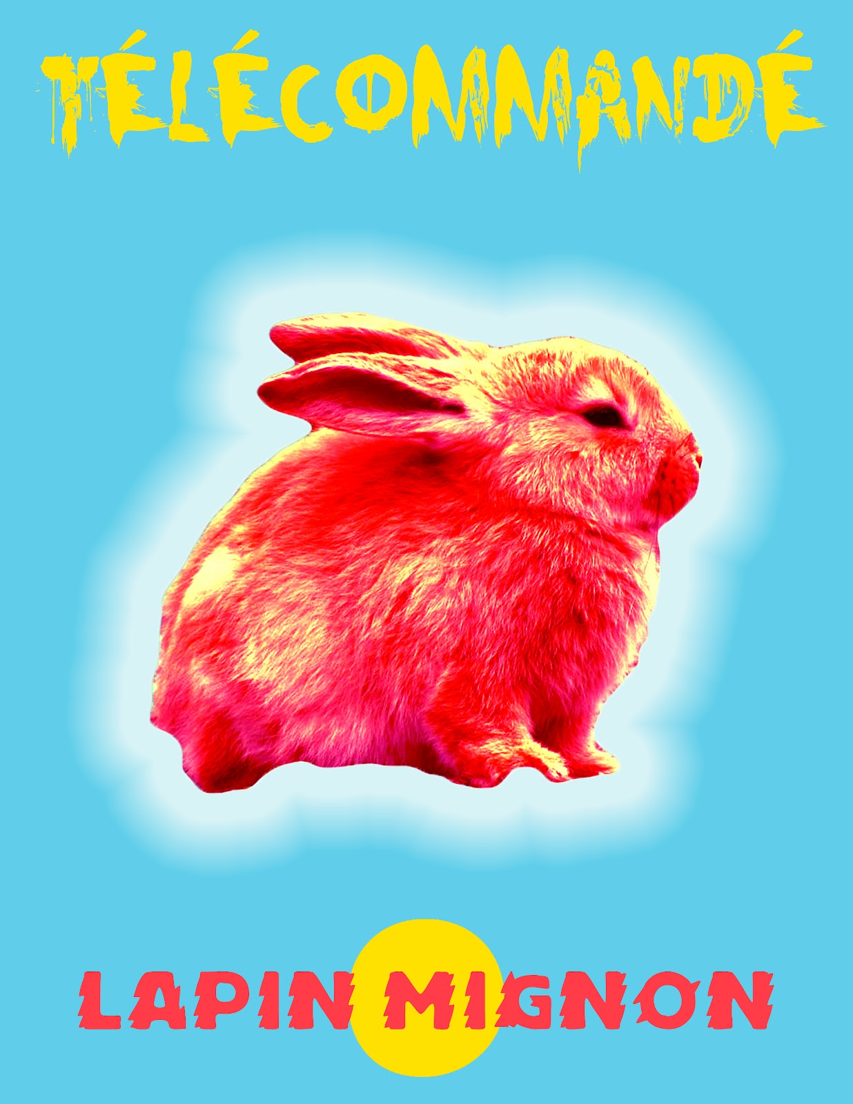
All of these ideas were expressed
in a fictional international marketing campaign for bunnies. I chose to use
bunnies because of their innate reproductive prowess.
My productive process started very
early. During the first week of the semester my housemate showed me this
Japanese music video that her brother had been obsessed with over the winter
break. The video was of Japanese performer Kyary Pamyu Pamyu.
Kyary is from the Harajuku area of
Tokyo and her environment has had a great impact on her music and fashion.
The video struck me as very odd but
what I found to be even more peculiar was the number of views that the video
had on YouTube. The upload I saw was from a western fan of Japanese music and
not the record label that is marketing the music in Japan.
Upon noticing that a westerner
uploaded the video, I immediately thought of the kind of person that had sought
out this video and saw enough value in it to share it with the western world.
This caused a chain of thoughts that jumped from giant anime conventions to
people dressing up like characters from video games and then to Pokémon
costumes and subsequently my experience with Pokémon.
I then began to think of how many
people in my generation were affected by the Pokémon craze. When you ask people
of my generation to list things that they liked when they were children,
Pokémon inevitably comes up. It was a cultural phenomenon that many people
claim as part of their childhood, and in some cases part of their current life.
A few other cultural imports like
Teletubbies and Ironchef came to mind and I began to become interested in how
those products were exposed to other cultures and how they were modified so
that the target culture would respond positively to the products. Infomercials
became something that I wound up drawing allot of my colors from. Internet and
print ads became something that I sought to emulate in order to understand how
they grab and sustain people’s attention.
In Ironchef, the entire show was
reshot using western participants and western ingredients that western
audiences could relate to, while Teletubbies was virtually untouched in its
airing. In Pokémon, the episodes were re-dubbed in English and the characters
were given different names that matched the mouth movements of the Japanese
animation. Ultimately it was the idea of cultural adaptations that became the
focus of my product. I wanted to make people want to own and have the product
displayed.
Something else that influenced my
project was my seeing the American version of The Girl with the Dragon Tattoo
movie. I liked the American adaptation much better than the Swedish version. I
was then surprised to see that the movie did better internationally than it did
domestically and that despite bad domestic revenue the studio that produced the
movie is moving on with the sequels. I then came to the conclusion that there
is a central human element that is something like “universal taste” or “universal
appeal” and that the idea, whatever it is, has been influenced by western
culture and cultural imperialism.
I then applied the principle of
cultural imperialism to my product and created a path that showed the spread of
the product by arbitrarily drawing a line on a map with Japan being the vertex.
The randomness of the line drawing illustrates the coincidence that plays a
part in marketing and trade.
The path of the cultural empire’s
expansion was documented in an artists book, something that served as both an
illustration of the ads in print form but also as a type of cultural scrap book
where some fictional character collected the posters and assembled them into a
book.
Conceptually I think I grew allot
with this assignment. Conceptualizing my work and giving myself a purpose for
working is something that I have struggled with. Recently a professor asked me
how I am connected to the world and how my art shows my connection.
Unfortunately she asked me this after I had completed Project 1 but the
question clicked everything into place nonetheless.
Technically I learned a lot of
stuff by accident in Photoshop. I accidently learned how to quickly
select what I want using the quick-select tool and then refining the edges.
Before, I would meticulously drop down the magnetic lasso tool. I also learned
that there is this thing called a “color library” in Photoshop. It contributed
to greater experimentation with color in my later ads.
I normally have pretty good work
habits. I tend to work steadily on projects over a long period of time instead
of working on something erratically in a short amount of time. This was
particularly helpful in this project because of the amount of images I was
creating. It allowed me to do extensive research into finding just the right
open-source images of the bunnies, double check my translations on languages
that I am familiar with and get things translated into languages that I am not,
and it allowed me to step back and look at my project and realize that it felt
unfinished. If I hadn’t worked steadily on the project I would never have had
the time to put the GIF animations together and thus tie up the whole endeavor.
Overall I think my project was
successful. When I show the images to people, a common reaction is “Aww how
cute! I want one!” The first time I heard that I knew that I had met my goal of
using visual language to create a sense of desire for an object, even if the
object doesn’t exist.
The messages about global
commercial culture and cultural imperialism are only noticeable when the images
are viewed together. If I were to show the project in a gallery I would show
multiple images and not just one.
The colors of my ads really affect
how they are digested. I spent a lot of time on the typographical and chromatic
elements of each poster and how they interacted with each other and with the
whole image. The later ads are more successful because they use a more
distilled visual language and utilize color and form much better than the
earlier ads, which were busy and relatively bland.
I would give myself a B+ for the project. Although the
project was successful I stayed in my two-dimensional comfort zone. I did add a
time based element at the end, which tied the project together, but unlike my
other classmates who used programs and technology that were completely new to
them, I used software that I was familiar with.
Wednesday, February 15, 2012




Subscribe to:
Posts (Atom)